Monday, October 31, 2011
Tuesday, October 25, 2011
Sunday, October 23, 2011
Tuesday, October 18, 2011
Project#4: Corporate Identity - Part#2 (Business Card)
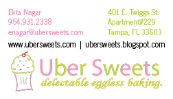
Business Card Idea#1:
I chose to put the logo on the bottom and information on top because the logo is somewhat of an odd shape. I chose to put the websites in black in order to break up the text from the graphic.
Business Card Idea#2:

I changed the color of the websites to see how it would look if it was not black. I did the color opposite of the color of the information on top so it stands out.
Business Card Idea#3:
 I made the graphic part of the logo and separated it from the text. I don't think this idea ended up being very effective because it takes away from the professionalism.
Business Card Idea#4:
 I decided to see how the logo would look on top rather than at the bottom. I chose to put the websites in black in order to break up the text from the graphic.
Business Card Idea#5:
Here I changed the color of the websites to see how it would look if it was not black. I did the color opposite of the color of the information on top so it stands out.
I chose to put the logo on the bottom and information on top because the logo is somewhat of an odd shape. I chose to put the websites in black in order to break up the text from the graphic.
Business Card Idea#2:

I changed the color of the websites to see how it would look if it was not black. I did the color opposite of the color of the information on top so it stands out.
Business Card Idea#3:
 I made the graphic part of the logo and separated it from the text. I don't think this idea ended up being very effective because it takes away from the professionalism.
 Business Card Idea#4:
 I decided to see how the logo would look on top rather than at the bottom. I chose to put the websites in black in order to break up the text from the graphic.
Business Card Idea#5:
Here I changed the color of the websites to see how it would look if it was not black. I did the color opposite of the color of the information on top so it stands out.
Saturday, October 15, 2011
Project#4: Corporate Identity - Part 1 (Questionnaire)
1) What is your business?
We are a bakery that specializes in egg-less deserts.
2) Describe your business in one sentence.
We make egg-less baked goods for those who are allergic to it or don't eat it due to dietary restrictions.
3) Who is your target audience?
People who love quality baked goods. Especially those who do not consume eggs.
4) Who are your competitors?
Bruegger's Bagel Bakery, La Segunda Central Bakery, Alessi Bakery, and Tropical Cafe and Bakery.
5) What makes them better/worse than your product/service?
Bruegger's specializes in bagels, while we specialize in deserts. La Segunda specializes in Cuban bread while we specialize in deserts. None of the bakeries nearby speacialize in just deserts.
6) Do you currently have an identity?
No, this is a new company.
7) (If your answer to #6 is no, skip this question) What do you like about it and what don’t you like about it?
We do not already have an identity.
8) How do you want your image to be seen in two years?
We want this company to be seen as a place you can enjoy a high quality egg-less sweet indulgence.
9) If your company was an animal, what animal would it be and why?
A panda bear because they are vegetarians and that is mainly what our bakery will cater to.
10) If your company/brand was a person, who would it be and why?
Ellen DeGeneres because she is a vegan.
11) If your company/brand was an object, what would it be?
A broken egg because our products are egg-less.
12) If your customer was a cartoon character, who would it be?
Lisa Simpson because she is a vegetarian.
Sunday, October 9, 2011
Sunday, October 2, 2011
Subscribe to:
Comments (Atom)


