For some reason, the audio would not render when making the video file - sorry!
Monday, December 12, 2011
Sunday, November 20, 2011

Final Project: Animated Commercial - Step#2 (Storyboards)
 My basic idea is to have all the items in the first row come in down the table individually and go into the pot like the picture in the middle. Then they all mix together in a puff of smoke while the sad eggs watch. And out of the bowl comes a cupcake (the same one from the logo).
Wednesday, November 9, 2011
Final Project: Animated Commercial - Step#1 (Ideas)
Idea#1: Have all of the ingredients for a cupcake (buter,sugar,flour,etc) all bouncing around and then at the end, have them come together to make a cupcake (maybe the same cupcake from the logo).
Idea#2: Have a bunch of people walking towards the same place. Then have text questioning why people are going there and what the big deal is. Then show the logo and have a voice-over talk about the new eggless bakery.
Idea#3: Have a bunch of chefs bowling and instead of pins it is eggs and when they get a strike, the animation has an egg. Then a narration about how the bakery is eggless.
Idea#4: Have a chef whisking something in a bowl and he is about to crack an egg into it and someone runs up in slow motion and catches the egg before it falls into the bowl. Then a narration about how the bakery is eggless.
Idea#5: A bunch of people at the bakery enjoying the food.
Sunday, November 6, 2011
Assignment#5: Commercial Evaluations
Commercial#1: Sprint
http://www.youtube.com/watch?v=lW_9SYaWAQg
This is a commercial for Sprint (it was not for one of their products in particular). It has a mix of all three styles: animation, live action, and stop motion. The three are blended very well and using all three definitely enhanced the commercial. The tone is happy and the target audience is anyone who knows how to use technology/a cell phone. They are saying that by purchasing a Sprint phone, it will make life easier because everything will be on one screen rather than having many different products/screens to do the same things. There is no narrator- it is all written out in text with instrumental music in the back. I feel that this commercial is successful in that it reaches a wide audience and is entertaining.
Commercial#2: Sherwin-Williams
http://www.youtube.com/watch?v=hWUrM0IZaDQ
This is an animated commercial for Sherwin-Williams.The tone is happy as it is bright and follows bees around pretty flowers and vivid colors (made from color chips). The target audience is average families - it is the best paint for the most reasonable price. They are saying that they can solve the problem of bad quality paint because they have the best quality. There is no narration - but there is a song playing in the background. I feel that this commercial is successful in that it shows the vividness of their colors through the animation and it is fun.
Commercial#3: Amazon Kindle
http://www.youtube.com/watch?v=nYUVpjrzvXc
This is a stop motion commercial for the Amazon Kindle. The tone is mysterious, this is created by the music playing in the back. There is no narration, only the song. The target audience is anyone in any walk of life. They show the Kindle being used in various settings on order to show that it can be useful in every situation in life. I feel that this commercial is successful in that it shows that anyone can use it in any situation in life and it is upbeat.
Commercial#4: Swiss International Airlines
http://www.youtube.com/watch?v=QynEN6e4mXo
This is a stop motion commercial for Swiss International Airlines. I could not really identify a tone to the commercial - it was just really slow. There is no narration, just instrumental music playing in the background. The target audience is anyone who would be flying on that airline. the problem they solve is being uncomfortable on plane rides. They solve it by making the plane like a second home. I don't feel that this commercial is successful because it is boring and it takes away from the meaning.
Commercial#5: Doritos
http://www.youtube.com/watch?NR=1&v=4rsEnwKrsvc
This is a live action commercial for Doritos. The tone is humorous and there is no narration- just dialogue. The target audience in everyone young and old. The commercial uses humor to sell their product rather than showing that it solves a problem. I felt that this comedic approach made the commercial successful.
Monday, October 31, 2011


Tuesday, October 25, 2011

Sunday, October 23, 2011


Tuesday, October 18, 2011
Project#4: Corporate Identity - Part#2 (Business Card)
Business Card Idea#1:
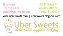 I chose to put the logo on the bottom and information on top because the logo is somewhat of an odd shape. I chose to put the websites in black in order to break up the text from the graphic.
Business Card Idea#2:

I changed the color of the websites to see how it would look if it was not black. I did the color opposite of the color of the information on top so it stands out.
Business Card Idea#3:
 I made the graphic part of the logo and separated it from the text. I don't think this idea ended up being very effective because it takes away from the professionalism.
Business Card Idea#4:
 I decided to see how the logo would look on top rather than at the bottom. I chose to put the websites in black in order to break up the text from the graphic.
Business Card Idea#5:

Here I changed the color of the websites to see how it would look if it was not black. I did the color opposite of the color of the information on top so it stands out.
Business Card Idea#2:
I changed the color of the websites to see how it would look if it was not black. I did the color opposite of the color of the information on top so it stands out.
Business Card Idea#3:
I made the graphic part of the logo and separated it from the text. I don't think this idea ended up being very effective because it takes away from the professionalism. Business Card Idea#4:
I decided to see how the logo would look on top rather than at the bottom. I chose to put the websites in black in order to break up the text from the graphic.Business Card Idea#5:
Here I changed the color of the websites to see how it would look if it was not black. I did the color opposite of the color of the information on top so it stands out.
Saturday, October 15, 2011
Project#4: Corporate Identity - Part 1 (Questionnaire)
1) What is your business?
We are a bakery that specializes in egg-less deserts.
2) Describe your business in one sentence.
We make egg-less baked goods for those who are allergic to it or don't eat it due to dietary restrictions.
3) Who is your target audience?
People who love quality baked goods. Especially those who do not consume eggs.
4) Who are your competitors?
Bruegger's Bagel Bakery, La Segunda Central Bakery, Alessi Bakery, and Tropical Cafe and Bakery.
5) What makes them better/worse than your product/service?
Bruegger's specializes in bagels, while we specialize in deserts. La Segunda specializes in Cuban bread while we specialize in deserts. None of the bakeries nearby speacialize in just deserts.
6) Do you currently have an identity?
No, this is a new company.
7) (If your answer to #6 is no, skip this question) What do you like about it and what don’t you like about it?
We do not already have an identity.
8) How do you want your image to be seen in two years?
We want this company to be seen as a place you can enjoy a high quality egg-less sweet indulgence.
9) If your company was an animal, what animal would it be and why?
A panda bear because they are vegetarians and that is mainly what our bakery will cater to.
10) If your company/brand was a person, who would it be and why?
Ellen DeGeneres because she is a vegan.
11) If your company/brand was an object, what would it be?
A broken egg because our products are egg-less.
12) If your customer was a cartoon character, who would it be?
Lisa Simpson because she is a vegetarian.
Sunday, October 9, 2011

Sunday, October 2, 2011

Sunday, September 25, 2011

Wednesday, September 14, 2011
Project#1: Logo (FINAL)
Color: I chose the green color because it is my favorite color and I chose the pink because I though it looked best with the shade of green that I had chosen.
Font: I chose this font because it was clean and clear and I liked the block text. I chose the bottom font because I thought a script-like font would add a sense of elegance. I chose a more detailed script font at first, but at the professors suggestion I chose a simple one because the more detailed one overpowered the logo and made it hard to read from a distance.
Graphic: At first when I drew this on the computer, I thought it looked somewhat childish and was not going to use it. I wasn't even planning on drawing anything since I am not much of an artist, but just to humor myself I did and I put it on the logo and to my surprise it did not look to bad. I thought it might take away from the sense of sophistication/elegance, but it did not hurt too much and it gave some meaning to the logo. I am still not sure if I like that the cherry on top is red, I think it might be a bit too distracting but I think it kind of makes it less monotonous with the same color scheme.
Sunday, September 11, 2011

Wednesday, September 7, 2011


Tuesday, September 6, 2011
Assignment#2: Logo Critiques
Critique: I think this logo is effective in its simplicity. It is clear and simple - and the color is one of my favorite colors. They only thing that I don't like about the logo is that it does not relate to the show at all - it does not give you any idea of what the show is about. I feel that the logo would have been a bit more effective if it had a graphic along with the text.
Logo# 2: Staples
This logo is effective in that it is clear and simple and the color is bright and stands out. I also like the fact that they have a graphic of a staple to show kind of what the store sells. The only issue is that it is hard to see that the graphic is a staple.
Logo# 3: World Wildlife Fund:
This logo is effective in that is shows that the cause is by depicting a panda bear to represent the wildlife that it seeks to preserve. I also like the simply black and white color. Also, the fact that the panda is cute does not hurt!
Logo# 4: Walt Disney Motion Pictures:
First of all, the font is very effective in that it is unique to Disney. Anyone would recognize that as Disney. Also, by putting a graphic of a castle in the back, it is relating it to Cinderella's castle at Disney World, thus, once again, associating it with Disney. The bright colors and fantastical background also make it more effective.

The color used behind the logo is effective in that it is the color of chocolate, thus making you think of chocolate. The shape is also in that of a chocolate bar. Adding the Kiss also enhances this image. One thing that I don't like is the writing on the bottom. The font is boring and kind of throws it off.
Tuesday, August 30, 2011
Project#1: Logo (Part 1)
1. 8 Till Late - already a company
2. NONG Food Services - No onion, No garlic cooking and catering
3. Uber Sweets - Bakery that does eggless baking
4. Holographic Cell Phones
5. Dragon Rides
6. Auto-Drive Cars
2. NONG Food Services - No onion, No garlic cooking and catering
3. Uber Sweets - Bakery that does eggless baking
4. Holographic Cell Phones
5. Dragon Rides
6. Auto-Drive Cars
Assignment#1 : The ART Blog
I am a sophomore at the University of Tampa and am majoring in Advertising/Public Relations and minoring in Marketing. I am the news section editor for the school newspaper, the Minaret. I already know the basics of Adobe Photoshop and InDesign, but I do not know anything about Illistrator. So, from this class, I hope to learn how to use the program and use it to the fullest. I also want to learn strategies for designing and ways to become effective at it. I am looking forward to the upcoming semester and hope to learn a lot!
Subscribe to:
Posts (Atom)