Sunday, September 25, 2011
Wednesday, September 14, 2011
Project#1: Logo (FINAL)
Color: I chose the green color because it is my favorite color and I chose the pink because I though it looked best with the shade of green that I had chosen.
Font: I chose this font because it was clean and clear and I liked the block text. I chose the bottom font because I thought a script-like font would add a sense of elegance. I chose a more detailed script font at first, but at the professors suggestion I chose a simple one because the more detailed one overpowered the logo and made it hard to read from a distance.
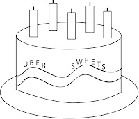
Graphic: At first when I drew this on the computer, I thought it looked somewhat childish and was not going to use it. I wasn't even planning on drawing anything since I am not much of an artist, but just to humor myself I did and I put it on the logo and to my surprise it did not look to bad. I thought it might take away from the sense of sophistication/elegance, but it did not hurt too much and it gave some meaning to the logo. I am still not sure if I like that the cherry on top is red, I think it might be a bit too distracting but I think it kind of makes it less monotonous with the same color scheme.
Sunday, September 11, 2011
Wednesday, September 7, 2011
Tuesday, September 6, 2011
Assignment#2: Logo Critiques
 Logo# 1: Psych (TV Show)
Critique: I think this logo is effective in its simplicity. It is clear and simple - and the color is one of my favorite colors. They only thing that I don't like about the logo is that it does not relate to the show at all - it does not give you any idea of what the show is about. I feel that the logo would have been a bit more effective if it had a graphic along with the text.

Logo# 2: Staples
This logo is effective in that it is clear and simple and the color is bright and stands out. I also like the fact that they have a graphic of a staple to show kind of what the store sells. The only issue is that it is hard to see that the graphic is a staple.

Logo# 3: World Wildlife Fund:
This logo is effective in that is shows that the cause is by depicting a panda bear to represent the wildlife that it seeks to preserve. I also like the simply black and white color. Also, the fact that the panda is cute does not hurt!

Logo# 4: Walt Disney Motion Pictures:
First of all, the font is very effective in that it is unique to Disney. Anyone would recognize that as Disney. Also, by putting a graphic of a castle in the back, it is relating it to Cinderella's castle at Disney World, thus, once again, associating it with Disney. The bright colors and fantastical background also make it more effective.
Logo# 4: Hershey's
The color used behind the logo is effective in that it is the color of chocolate, thus making you think of chocolate. The shape is also in that of a chocolate bar. Adding the Kiss also enhances this image. One thing that I don't like is the writing on the bottom. The font is boring and kind of throws it off.
Subscribe to:
Comments (Atom)


